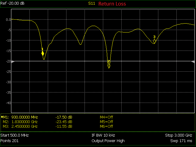
You can find this antenna here at the Nuand store. I took their return loss test graphic and converted it into a digital form which you can find further down. I had trouble getting it as precise as I had liked but it might work for what you want if you use or will use this antenna.

The above is the return loss in graphical form. I mapped the pixel positions to the frequency and decibel values. The program I used is below. It will produce the pickle file which you can load up and use in another program.
import numpy as np
import matplotlib.pyplot as plt
import pickle

def main():
    known_points = [
        (139.2, 182, 930e6, 17.5),
        (355.5, 222.2, 1.83e9, 23.45),
        (504.2, 141.8, 2.45e9, 11.55),
    ]

    xd = known_points[1][0] - known_points[0][0]
    fd = known_points[1][2] - known_points[0][2]
    yd = known_points[1][1] - known_points[0][1]
    dd = known_points[1][3] - known_points[0][3]

    freq_px = fd / xd
    db_py = dd / yd

    points = [
        (39.5, 62.5),
        (64.5, 65.5),
        (95.5, 67.0),
        (105.5, 68.5),
        (113.5, 73.5),
        (118.5, 79.5),
        (121.5, 87.5),
        (125.0, 97.0),
        (132.5, 127.5),
        (136.5, 161.5),
        (142, 183,),
        (143, 184,),
        (151, 168),
        (159.8, 146.8),
        (161.8, 144.0),
        (166, 142.5),
        (168.5, 138),
        (171.5, 132),
        (176.5, 120),
        (184.5, 112.8),
        (199.8, 101.8),
        (209, 96.5),
        (216, 93.8),
        (225.8, 93.5),
        (231.8, 96.2),
        (238, 102.8),
        (242.8, 110.5),
        (249.2, 121.2),
        (255, 132.5),
        (261.2, 145.2),
        (264.2, 145.5),
        (268.2, 137),
        (272.5, 125.2),
        (275.8, 115),
        (282.2, 101.5),
        (289, 90.5),
        (298.8, 84.8),
        (310.2, 84.5),
        (317.8, 89.2),
        (323.5, 93.8),
        (329.8, 100.8),
        (335.5, 110.2),
        (340.5, 123.2),
        (345, 144.2),
        (348.2, 165.2),
        (349.2, 183.2),
        (351.2, 201.0),
        (352.8, 215.5),
        (355, 222.2),
        (358, 217.2),
        (360, 193.8),
        (362.5, 174.2),
        (366, 148),
        (370, 130.2),
        (373.2, 119.8),
        (377.5, 111.5),
        (383.5, 105.5),
        (386.8, 103.8),
        (395.2, 104.2),
        (402, 105.2),
        (420.8, 105.5),
        (426.8, 103.5),
        (434, 100.5),
        (440.8, 96.5),
        (447.5, 94.5),
        (454, 94.5),
        (457.5, 96.2),
        (462, 99.5),
        (468.8, 105.5),
        (479.5, 120.5),
        (490.5, 132.5),
        (498, 140.5),
        (502, 142.5),
        (507.2, 137.8),
        (512.8, 127.2),
        (520, 115.5),
        (525.8, 108.2),
        (530.5, 102.8),
        (537, 97),
        (540.5, 94.2),
        (543, 93.2),
        (550.2, 93.5),
        (557.2, 90.5),
        (565.8, 85.0),
        (576.2, 81.2),
        (589.8, 78.0),
        (603.5, 76.2),
        (611.8, 77.5),
        (622.2, 78.8),
        (630.5, 80.5),
        (634.0, 81.5),
    ]

    t_points = []

    for point in points:
        freq = (point[0] - known_points[0][0]) * freq_px + known_points[0][2]
        db = (point[1] - known_points[0][1]) * db_py + known_points[0][3]
        t_points.append((freq, db))

    with open('tri_band_ant_gain.pickle', 'wb') as fd:
        pickle.dump(t_points, fd)

    t_points = np.array(t_points)

    plt.scatter(t_points[:, 0], t_points[:, 1])
    plt.show()

if __name__ == '__main__':
    main()
You can use np.interp to make interpolation easy. Just pickle.load the object then convert it to a Numpy array ant_data = np.array(pickle.load(file_like_object)) then feed it into the interpolation function along with the X values you want Y values for. For example, np.interp(x_values, ant_data[:, 0], ant_data[:, 1]).
I hope someone finds it useful or maybe the method I used. Like I said though it isn’t perfect. It could likely use some fiddling to get just a slightly better match to the actual plot. The values are just a little off but for my purposes they worked fine.